Start with decisions, not charts
Dashboards are easy to request and hard to use when nobody agrees on the question. Before you buy another reporting layer, write down three decisions you want to make faster. Maybe it is identifying cohorts that go quiet in week three. Maybe it is spotting courses where failure rates cluster on the same assessment.
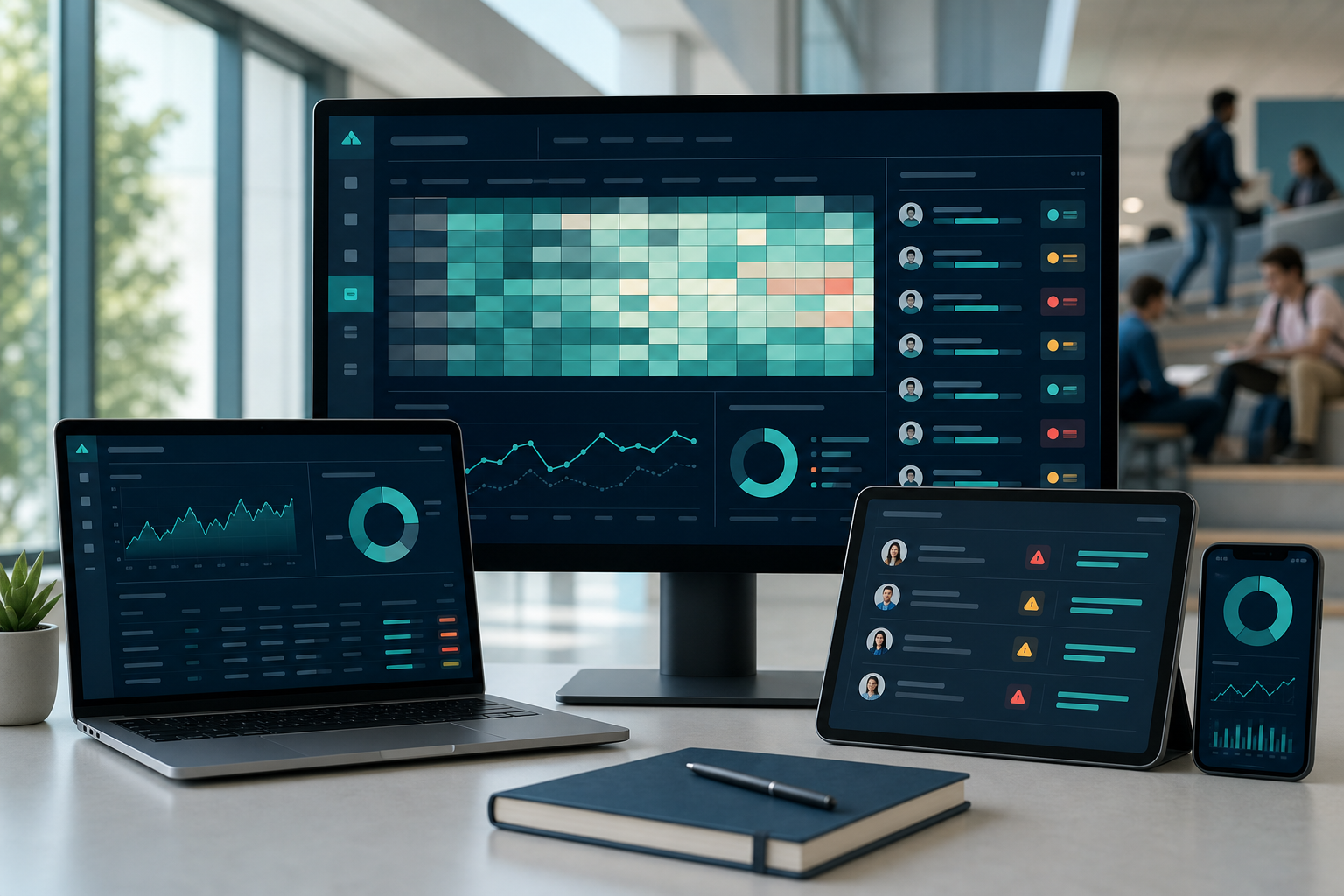
Moodle already holds rich signals: logins, activity completion, grades, forum participation, and quiz attempts. The gap is rarely "we have no data." It is "the right people cannot see the right slice without exporting spreadsheets."
When leaders align on decisions first, metric definitions become calmer. Everyone knows why a number exists and what action should follow.
Signals that usually matter in Moodle
Engagement timing tells you when students disappear, not just whether they finished. Assessment distributions show whether a single exam drives most risk. Activity-level data reveals whether resources were opened but not used, which is different from true participation.
Combine signals carefully. A student who stops logging in after a low quiz score needs a different conversation than a student who never opened the orientation module. Analytics should respect that nuance instead of collapsing people into one red flag.
Document how each signal is calculated. Future you will thank present you when accreditation asks for definitions.
Where default reporting falls short
Built-in Moodle reports help administrators, but deans and student success teams often need cross-course views, term-over-term comparisons, and cohort filters that match how they actually work. Without them, analysts rebuild the same pivot tables every semester.
Early alert is another gap. Knowing that risk exists is not the same as routing a list to advisors with course context, last activity, and suggested outreach. Spreadsheets can do that manually until they cannot.
Privacy rules still apply. Pseudonymization, retention windows, and audit trails for who opened a student record are not optional in many jurisdictions.
Governance that keeps trust
Create roles that mirror responsibility. Faculty see their sections. Chairs see their departments. Advisors see caseloads. Central IR sees aggregated views. When access matches job function, fewer people worry about surveillance vibes.
Schedule a monthly review with teaching and student success at the same table. Ask which alerts led to helpful conversations and which were noise. Turn off noisy rules. Tune the ones that changed persistence.
Analytics programs age like courses: they need revisions, not just launches.
From measurement to intervention
The payoff appears when insight triggers a workflow. An advisor email, a faculty nudge, a tutoring referral, a resource module unlocked for students who missed a prerequisite quiz. Each action should be trackable so you can learn what worked.
Edora Analytics connects Moodle data to those workflows with role-based dashboards and exportable lists that respect governance. Pair it with MoodQ if you want qualitative wellbeing signals next to quantitative risk.
Start with one faculty and one metric you already argue about. Fix that metric together. Expansion gets easier after the first win.